Colors
Booker Williams
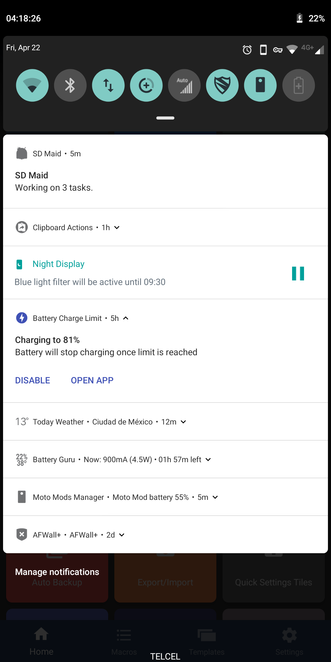
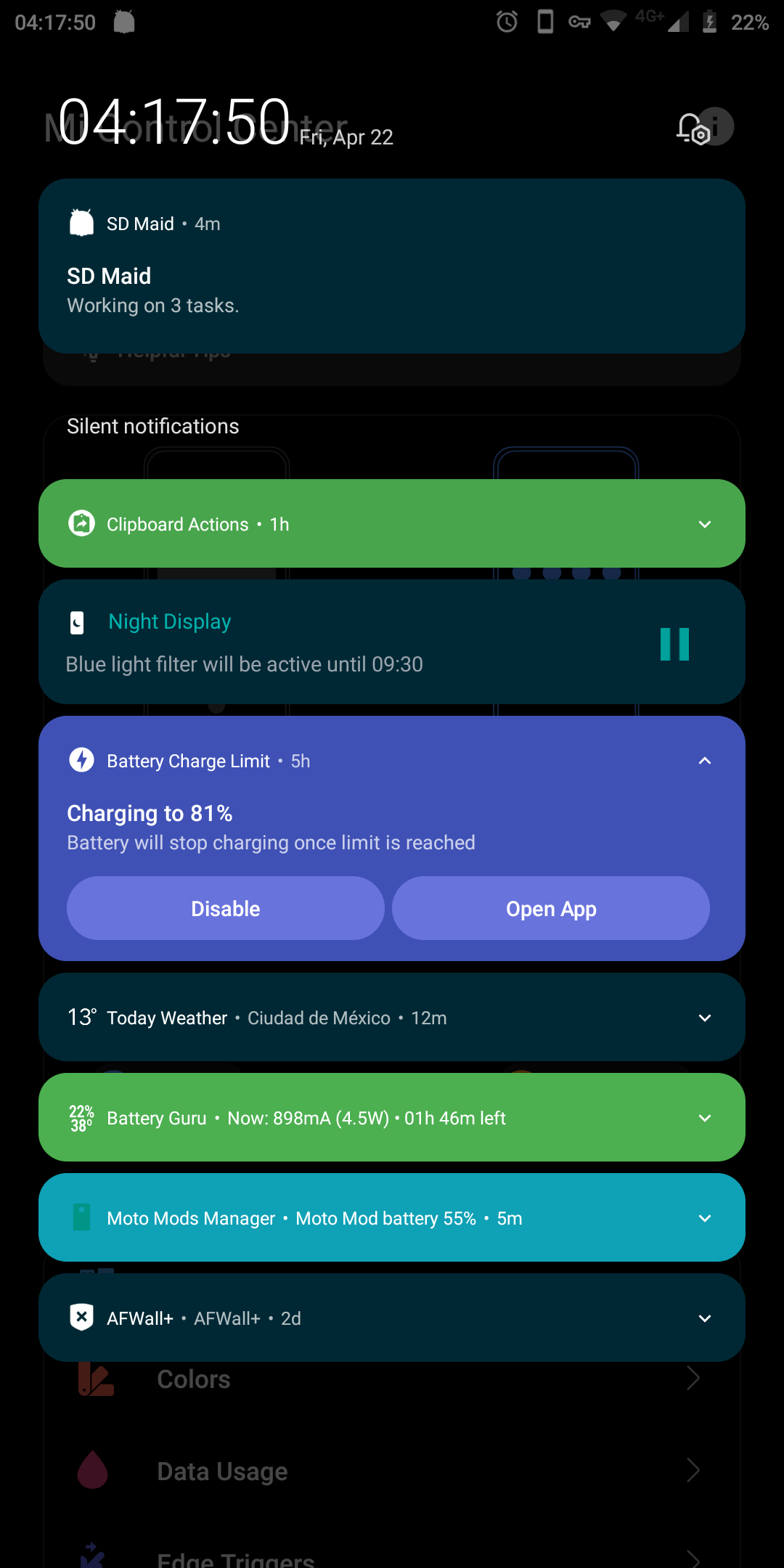
Perhaps coloring the ticker using the notification's icon color of the notifying app could make a better looking banner overall. Some notifications get a black and white scheme even having colored icons inside the original notification. I've added the look of another app as a reference alongside the original notification shade to illustrate.
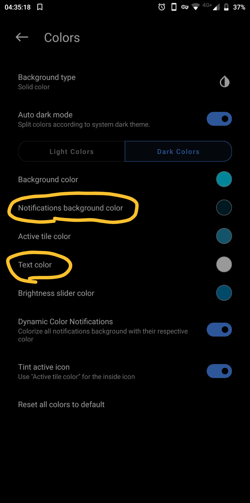
For apps with no particular color, choosing a default color scheme (background and font color) could be a better option to avoid b&w. In the example I've chosen blue and white. I've highlighted the particular settings to give a better idea of how it could integrate into SSB.